Yes, It is true that not every brand
uses bright colors...
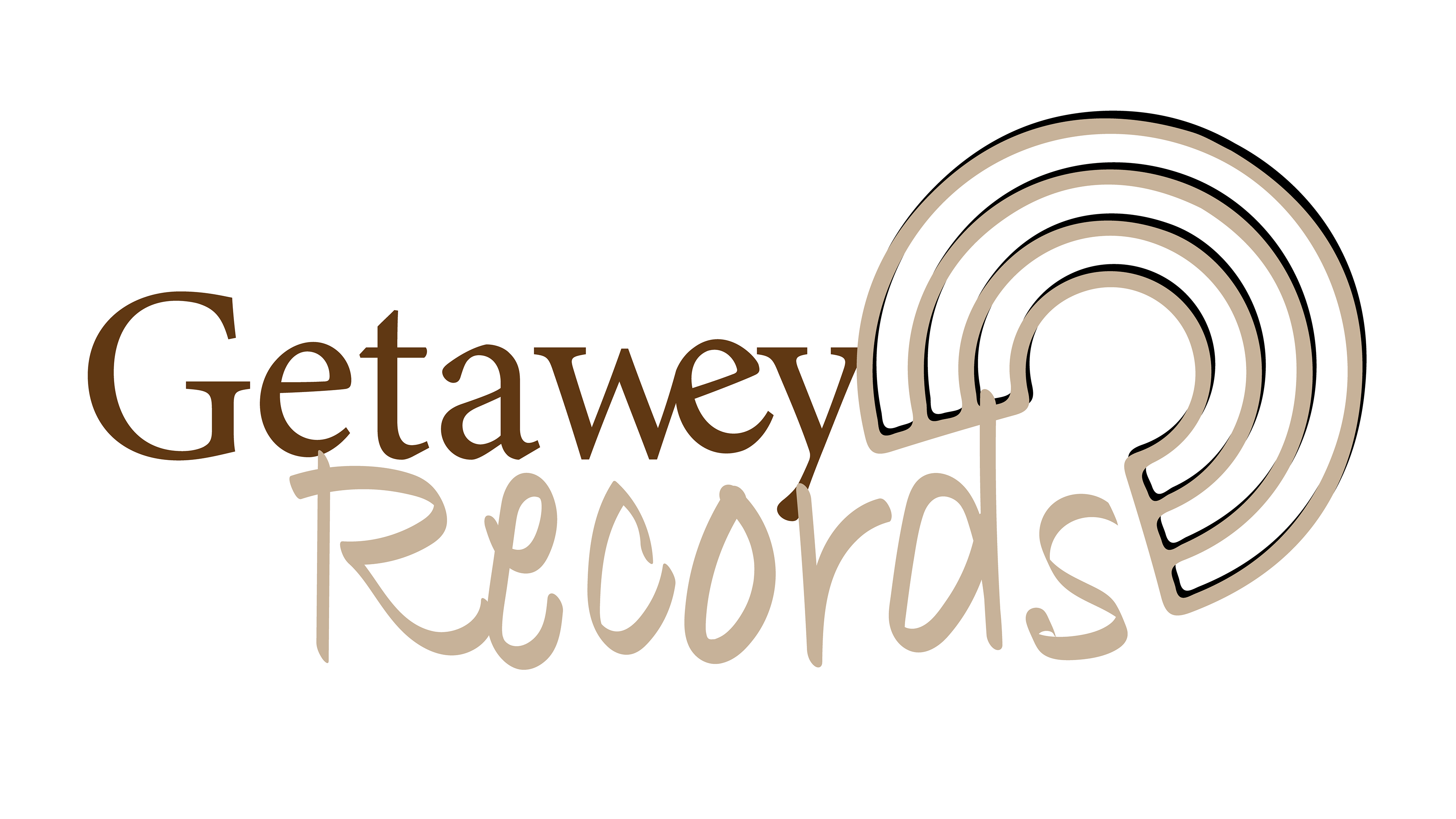
At Getawey Records, the music is light and
the mood is brown. The founding of
its logo had come
with calm.
#Fiction #CaseStudy

The Beginning
Mikey popped out of nowhere. It was just about afternoon time. "You make logos right?" he asked. "I've recently started up a new studio in town, I'd like for you to make a logo for me." I sat quietly for a minute. And then I said it. "Say no more."
He remained quiet. "I shall get back to you in a week," I said.
One Week Later: The Brief
After a few correspondence. The brief was set:
Mikey's studio was open to all, and the music they made felt both welcoming and inspiring. Mikey was building a work environment where his valued musician customers could feel calm and at home.
Most of the musicians that visited Mikey's studio were acoustically minded, and more of them were more retro than they were modern with their playing style. Mikey however also wanted to appeal to a younger set of users in the near future. He had been hearing a lot about some contemporary acts in his area and was very much looking forward to working with them. This brought Mikey to ask around in search of a designer to help him achieve his branding and business goals. And there, Mikey was soon at my table.
The Product and Delivery
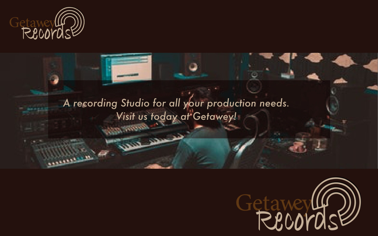
The Deliverables: Logo Design, Social Media Banner in different sizes + Basic Branding Guidelines.
As Mikey was pretty much straight forward about his business need and knew exactly what he wanted, it took just about three days to bring the package together. At the delivery of the project files, I am happy to say that Mikey was well pleased!